

Font feel
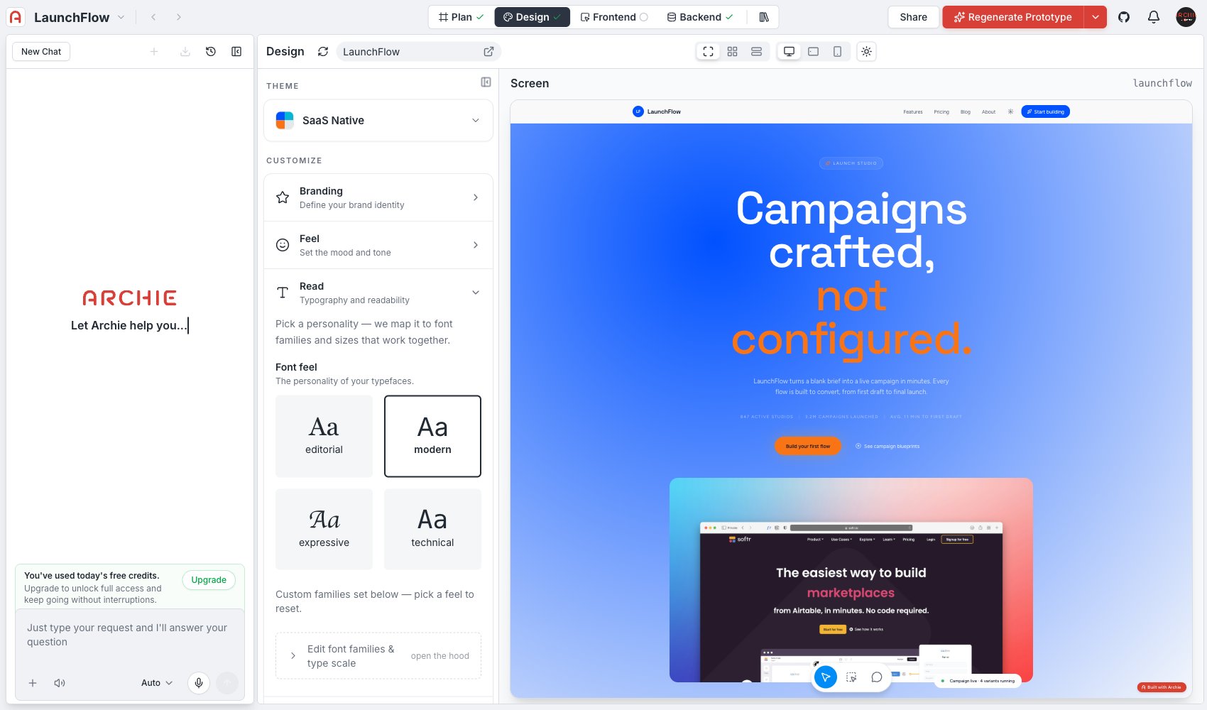
Four presets, each previewed with a live “Aa” sample:- Editorial — serif or serif-adjacent headings, built for long-form reading and a considered, print-influenced tone.
- Modern — clean geometric or humanist sans, the default for most SaaS products.
- Expressive — more distinctive display type, for brands that want typography to carry personality.
- Technical — precise, often monospace-influenced, suited to developer tools and data-dense products.
Advanced editing
Click Edit font families & type scale to set specific font families and the type scale directly, instead of using a Font feel preset. Use this when you have a specific typeface in mind, or need a size relationship the presets do not cover.FAQ
Can I use a custom font that isn't in the presets?
Can I use a custom font that isn't in the presets?
Yes — use Edit font families & type scale to set any font family directly.
Does Read affect font size in Feel's density settings too?
Does Read affect font size in Feel's density settings too?
They’re independent. Read sets font family and the type scale; Feel sets spacing and padding around that type.