> ## Documentation Index
> Fetch the complete documentation index at: https://archie.com/docs/llms.txt
> Use this file to discover all available pages before exploring further.
# Polish
> Corners, shadows, and icon stroke — the surface character of every element.
Polish controls the small details that give your UI its surface character — sharp or rounded, flat or lifted, thin or bold icons. These are the values that make two apps with the same colors and type still feel different.
## Corners
How rounded elements are.
* **Soft** — larger radii, feels approachable.
* **Balanced** — a moderate radius that works for most products.
* **Sharp** — minimal or no radius, feels editorial and precise.
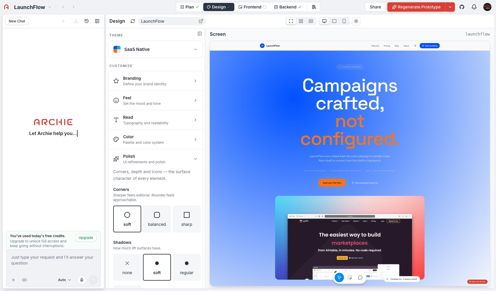 ## Shadows
How much lift surfaces have.
* **None** — flat, no elevation cues.
* **Soft** — subtle lift, barely-there depth.
* **Regular** — standard elevation, the default for most card- and modal-based UIs.
* **Strong** — pronounced elevation for a more dramatic, layered look.
## Icon stroke
Line weight — changes every icon in the preview.
* **Thin**
* **Regular**
* **Bold**
## Advanced editing
Open the radius, shadow, and icon editor to set specific values directly instead of using the presets above.
## FAQ
Yes — they're global values, so buttons, cards, inputs, and modals all pick up the same radius and shadow values automatically. See [Components](/docs/features/design/components) to check them on real UI.
## Shadows
How much lift surfaces have.
* **None** — flat, no elevation cues.
* **Soft** — subtle lift, barely-there depth.
* **Regular** — standard elevation, the default for most card- and modal-based UIs.
* **Strong** — pronounced elevation for a more dramatic, layered look.
## Icon stroke
Line weight — changes every icon in the preview.
* **Thin**
* **Regular**
* **Bold**
## Advanced editing
Open the radius, shadow, and icon editor to set specific values directly instead of using the presets above.
## FAQ
Yes — they're global values, so buttons, cards, inputs, and modals all pick up the same radius and shadow values automatically. See [Components](/docs/features/design/components) to check them on real UI.